CSS / HTML: Tạo đường viền phát sáng xung quanh Trường nhập liệu


171

Tôi muốn tạo một số đầu vào phong nha cho biểu mẫu của mình và tôi thực sự muốn biết TWITTER thực hiện đường viền phát sáng xung quanh đầu vào của chúng như thế nào.

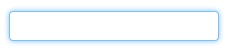
Ví dụ / Hình ảnh về đường viền Twitter:

nhập mô tả hình ảnh ở đây

Tôi cũng không biết cách tạo các góc tròn.


7
Đây là một hướng dẫn dạy cho bạn cách: Hiệu ứng phát sáng CSS với bóng hộp
Town

Liên kết của @Town dường như bị rối loạn: vòng lặp chuyển hướng.
JeroldHaas

Câu trả lời:


414

Ở đây bạn đi:

.glowing-border {
    border: 2px solid #dadada;
    border-radius: 7px;
}

.glowing-border:focus { 
    outline: none;
    border-color: #9ecaed;
    box-shadow: 0 0 10px #9ecaed;
}

Bản demo trực tiếp: http://jsfiddle.net/simevidas/CXUpm/1/show/

(để xem mã cho bản demo, hãy xóa "show /" khỏi URL)

label { 
    display:block;
    margin:20px;
    width:420px;
    overflow:auto;
    font-family:sans-serif;
    font-size:20px;
    color:#444;
    text-shadow:0 0 2px #ddd;
    padding:20px 10px 10px 0;
}

input {
    float:right;
    width:200px;
    border:2px solid #dadada;
    border-radius:7px;
    font-size:20px;
    padding:5px;
    margin-top:-10px;    
}

input:focus { 
    outline:none;
    border-color:#9ecaed;
    box-shadow:0 0 10px #9ecaed;
}
<label> Aktuelles Passwort: <input type="password"> </label>
<label> Neues Passwort: <input type="password"> </label>


4
Làm thế nào tôi có thể làm động các ánh sáng?
3lvis

17
@NSElvis ví dụ transition: box-shadow linear 1s jsfiddle.net/simevidas/6LyWe/1
Šime Vidas

Rất đẹp. Một điều, nếu bạn chỉ muốn điều này được áp dụng cho các trường nhập văn bản, bạn sẽ muốn hạn chế bộ chọn: input [type = text]: tập trung, input [type = password], input [type = textarea].
Michael Kennedy

1
@MichaelKennedy Trong các ứng dụng trong thế giới thực, điều đó là không đủ. Cách tiếp cận tiêu chuẩn sẽ là các lớp, ví dụ .glowing-input { … }.
Vidime Vidas

Chắc chắn, quan điểm của tôi là áp dụng cho các nút radio, gửi nút, vv mà có thể không muốn.
Michael Kennedy

30

Làm thế nào về một cái gì đó như thế này ... http://jsfiddle.net/UnsungHero97/Qwpq4/1207/

nhập mô tả hình ảnh ở đây

CSS

input {
    border: 1px solid #4195fc; /* some kind of blue border */

    /* other CSS styles */

    /* round the corners */
    -webkit-border-radius: 4px;
       -moz-border-radius: 4px;
            border-radius: 4px;


    /* make it glow! */
    -webkit-box-shadow: 0px 0px 4px #4195fc;
       -moz-box-shadow: 0px 0px 4px #4195fc;
            box-shadow: 0px 0px 4px #4195fc; /* some variation of blue for the shadow */

}

1
Điều này không dễ dàng trong và ngoài
rubo77

1
Vậy thì sao? câu trả lời được chấp nhận không làm dễ dàng. câu hỏi ban đầu (và câu trả lời của tôi) đã được đăng vào năm 2011 và tôi khá chắc chắn rằng các đường viền phát sáng của Twitter cũng không giảm bớt. hơn nữa, câu hỏi không tập trung vào sự dễ dàng, mà là làm thế nào để làm cho đường viền phát sáng với các góc tròn, mà tôi đã trả lời. Tôi không nghĩ bạn nên hạ thấp tôi chỉ vì không dễ dàng gì
Hristo

6

Sử dụng màu xanh bình thường border, trung bình border-radiusvà màu xanh box-shadowvới vị trí 0 0.


3

SLaks đánh vào đầu đinh nhưng bạn có thể muốn xem xét các thay đổi cho đầu vào trong CSS3 nói chung. Góc tròn và bóng hộp là cả hai tính năng mới trong CSS3 và sẽ cho phép bạn thực hiện chính xác những gì bạn đang tìm kiếm. Một trong những liên kết yêu thích cá nhân của tôi cho CSS3 / HTML5 là http://diveintohtml5.ep.io/ .


2

Tôi đã kết hợp hai trong số các câu trả lời trước đó ( jsfiddle ).

input {
    /* round the corners */
    border-radius: 4px;
    -moz-border-radius: 4px;
    -webkit-border-radius: 4px;    
}

input:focus { 
    outline:none;
    border: 1px solid #4195fc; 
    /* create a BIG glow */
    box-shadow: 0px 0px 14px #4195fc; 
    -moz-box-shadow: 0px 0px 14px #4195fc;
    -webkit-box-shadow: 0px 0px 14px #4195fc;  
}​

2

Phiên bản sửa đổi với phiên bản ít phát sáng hơn.

input {
    /* round the corners */
    //background-color: transparent;
    border: 1px solid;
    height: 20px;
    width: 160px;
    color: #CCC;
    border-radius: 4px;
    -moz-border-radius: 4px;
    -webkit-border-radius: 4px;    
}

input:focus { 
    outline:none;
    border: 1px solid #4195fc; 
    /* create a BIG glow */
    box-shadow: 0px 0px 5px #4195fc; 
    -moz-box-shadow: 0px 0px 5px #4195fc;
    -webkit-box-shadow: 0px 0px 5px #4195fc;  
}

0
input[type="text"]{
   @include transition(all 0.30s ease-in-out);
  outline: none;
  padding: 3px 0px 3px 3px;
  margin: 5px 1px 3px 0px;
  border: 1px solid #DDDDDD;
}
input[type="text"]:focus{
  @include box-shadow(0 0 5px rgba(81, 203, 238, 1));
  -webkit-box-shadow: 0px 0px 5px #007eff;  
  -moz-box-shadow: 0px 0px 5px #007eff;  
  box-shadow: 0px 0px 5px #007eff;
}

0

Dưới đây là mã mà Bootstrap sử dụng. Màu sắc hơi khác nhau nhưng khái niệm là như nhau. Đây là nếu bạn đang sử dụng LESS để biên dịch CSS:

// Form control focus state
//
// Generate a customized focus state and for any input with the specified color,
// which defaults to the `@input-focus-border` variable.
//
// We highly encourage you to not customize the default value, but instead use
// this to tweak colors on an as-needed basis. This aesthetic change is based on
// WebKit's default styles, but applicable to a wider range of browsers. Its
// usability and accessibility should be taken into account with any change.
//
// Example usage: change the default blue border and shadow to white for better
// contrast against a dark gray background.

.form-control-focus(@color: @input-border-focus) {
  @color-rgba: rgba(red(@color), green(@color), blue(@color), .6);
  &:focus {
    border-color: @color;
    outline: 0;
    .box-shadow(~"inset 0 1px 1px rgba(0,0,0,.075), 0 0 8px @{color-rgba}");
  }
}

Nếu bạn không sử dụng LESS thì đây là phiên bản được biên dịch:

.form-control:focus {
    border-color: #66afe9;
    outline: 0;
    -webkit-box-shadow: inset 0 1px 1px rgba(0, 0, 0, 0.075), 0 0 8px rgba(102, 175, 233, 0.6);
    box-shadow: inset 0 1px 1px rgba(0, 0, 0, 0.075), 0 0 8px rgba(102, 175, 233, 0.6);
}

0

Điều này sẽ tạo ra các trường đầu vào và textareas phát sáng:

textarea,textarea:focus,input,input:focus{
    transition: border-color 0.15s ease-in-out 0s, box-shadow 0.15s ease-in-out 0s;
    border: 1px solid #c4c4c4;
    border-radius: 4px;
    -moz-border-radius: 4px;
    -webkit-border-radius: 4px;
    box-shadow: 0px 0px 8px #d9d9d9;
    -moz-box-shadow: 0px 0px 8px #d9d9d9;
    -webkit-box-shadow: 0px 0px 8px #d9d9d9;
}

input:focus,textarea:focus { 
    outline: none;
    border: 1px solid #7bc1f7;
    box-shadow: 0px 0px 8px #7bc1f7;
    -moz-box-shadow: 0px 0px 8px #7bc1f7;
    -webkit-box-shadow: 0px 0px 8px #7bc1f7;
}

0

$('.form-fild input,.form-fild textarea').focus(function() {
    $(this).parent().addClass('open');
});

$('.form-fild input,.form-fild textarea').blur(function() {
    $(this).parent().removeClass('open');
});
.open {
  color:red;   
}
.form-fild {
	position: relative;
	margin: 30px 0;
}
.form-fild label {
	position: absolute;
	top: 5px;
	left: 10px;
	padding:5px;
}

.form-fild.open label {
	top: -25px;
	left: 10px;
	/*background: #ffffff;*/
}
.form-fild input[type="text"] {
	padding-left: 80px;
}
.form-fild textarea {
	padding-left: 80px;
}
.form-fild.open textarea, 
.form-fild.open input[type="text"] {
	padding-left: 10px;
}
textarea,
input[type="text"] {
	padding: 10px;
	width: 100%;
}
textarea,
input,
.form-fild.open label,
.form-fild label {
	-webkit-transition: all 0.2s ease-in-out;
       -moz-transition: all 0.2s ease-in-out;
         -o-transition: all 0.2s ease-in-out;
            transition: all 0.2s ease-in-out;
}
<script src="https://ajax.googleapis.com/ajax/libs/jquery/2.1.1/jquery.min.js"></script>
<div class="container">
	<div class="row">
    	<form>
        <div class="form-fild">
            <label>Name :</label>
            <input type="text">
        </div>
        <div class="form-fild">
            <label>Email :</label>
            <input type="text">
        </div>
        <div class="form-fild">
            <label>Number :</label>
            <input type="text">
        </div>
        <div class="form-fild">
            <label>Message :</label>
            <textarea cols="10" rows="5"></textarea>
        </div>
    </form>
    </div>
</div>


Khi sử dụng trang web của chúng tôi, bạn xác nhận rằng bạn đã đọc và hiểu Chính sách cookieChính sách bảo mật của chúng tôi.
Licensed under cc by-sa 3.0 with attribution required.