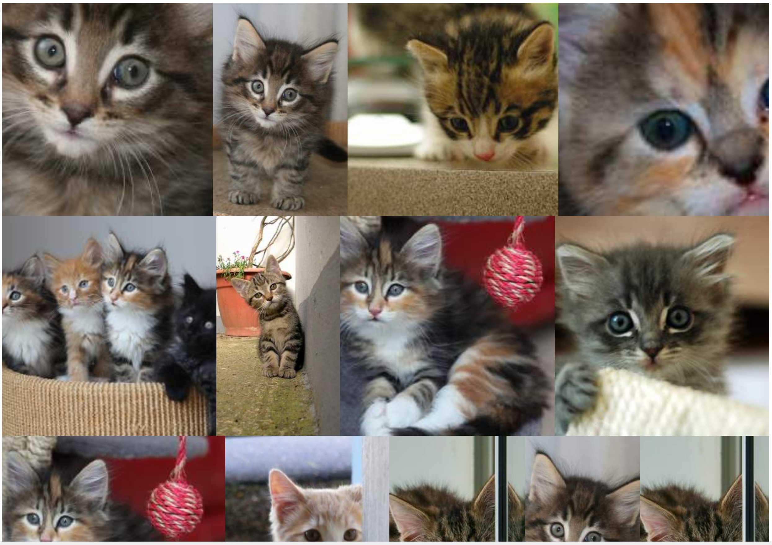
Hiển thị một bộ sưu tập hình ảnh của các hình ảnh và tỷ lệ kích thước khác nhau với các thông số kỹ thuật sau:
- Không có khoảng trống (lề) giữa các hình ảnh.
- Tôn trọng tỷ lệ ban đầu càng nhiều càng tốt.
- Hình ảnh được bao quanh bởi một liên kết.
- Giải pháp phi JS.
- Hình ảnh có thể được cắt một chút.
- Giải pháp di động.
- Đặt hình ảnh hiển thị là ngẫu nhiên.
- Hình ảnh phải được hiển thị từ trái sang phải (ngăn sử dụng các cột).
Tôi đã đạt được điều đó với giải pháp flexbox sau:
section {
  display: flex;
  flex-flow: row wrap;
  justify-content: center;
}
section a {
  flex: auto;
}
section img {
  height: 100%;
  width: 100%;
  object-fit: cover;
}
<!DOCTYPE html>
<html lang="en">
<head>
    <title>Controlling flex growability</title>
    <meta name="viewport" content="width=device-width,initial-scale=1">
    <style>

    </style>
</head>
<body>
    <section>
        <a href="#"><img src="https://placekitten.com/400/195" width="400" height="195" alt="Kitty"></a>
        <a href="#"><img src="https://placekitten.com/256/400" width="256" height="400" alt="Kitty"></a>
        <a href="#"><img src="https://placekitten.com/400/237" width="400" height="237" alt="Kitty"></a>
        <a href="#"><img src="https://placekitten.com/400/111" width="400" height="111" alt="Kitty"></a>
        <a href="#"><img src="https://placekitten.com/400/245" width="400" height="245" alt="Kitty"></a>
        <a href="#"><img src="https://placekitten.com/400/227" width="400" height="227" alt="Kitty"></a>
        <a href="#"><img src="https://placekitten.com/250/400" width="250" height="400" alt="Kitty"></a>
        <a href="#"><img src="https://placekitten.com/400/269" width="400" height="269" alt="Kitty"></a>
        <a href="#"><img src="https://placekitten.com/400/255" width="400" height="255" alt="Kitty"></a>
        <a href="#"><img src="https://placekitten.com/288/400" width="288" height="400" alt="Kitty"></a>
        <a href="#"><img src="https://placekitten.com/234/400" width="234" height="400" alt="Kitty"></a>
        <a href="#"><img src="https://placekitten.com/194/400" width="194" height="400" alt="Kitty"></a>
        <a href="#"><img src="https://placekitten.com/222/400" width="222" height="400" alt="Kitty"></a>
        <a href="#"><img src="https://placekitten.com/400/227" width="400" height="227" alt="Kitty"></a>
        <a href="#"><img src="https://placekitten.com/192/400" width="192" height="400" alt="Kitty"></a>
        <a href="#"><img src="https://placekitten.com/400/141" width="400" height="141" alt="Kitty"></a>
        <a href="#"><img src="https://placekitten.com/400/289" width="400" height="289" alt="Kitty"></a>
        <a href="#"><img src="https://placekitten.com/400/255" width="400" height="255" alt="Kitty"></a>
        <a href="#"><img src="https://placekitten.com/210/400" width="210" height="400" alt="Kitty"></a>
        <a href="#"><img src="https://placekitten.com/400/187" width="400" height="187" alt="Kitty"></a>
    </section>
</body>
</html>
Giải pháp hoạt động, nhưng tùy thuộc vào kích thước của cửa sổ, một số hình ảnh được phóng to quá mức, tôi sẽ thích nhiều yếu tố hơn trên mỗi hàng, ngay cả khi các mục cần được thu nhỏ hơn.
Điều này có nghĩa là thay vì:
Tôi muốn mật độ vật phẩm cao hơn để hình ảnh không bao giờ bị phóng to:
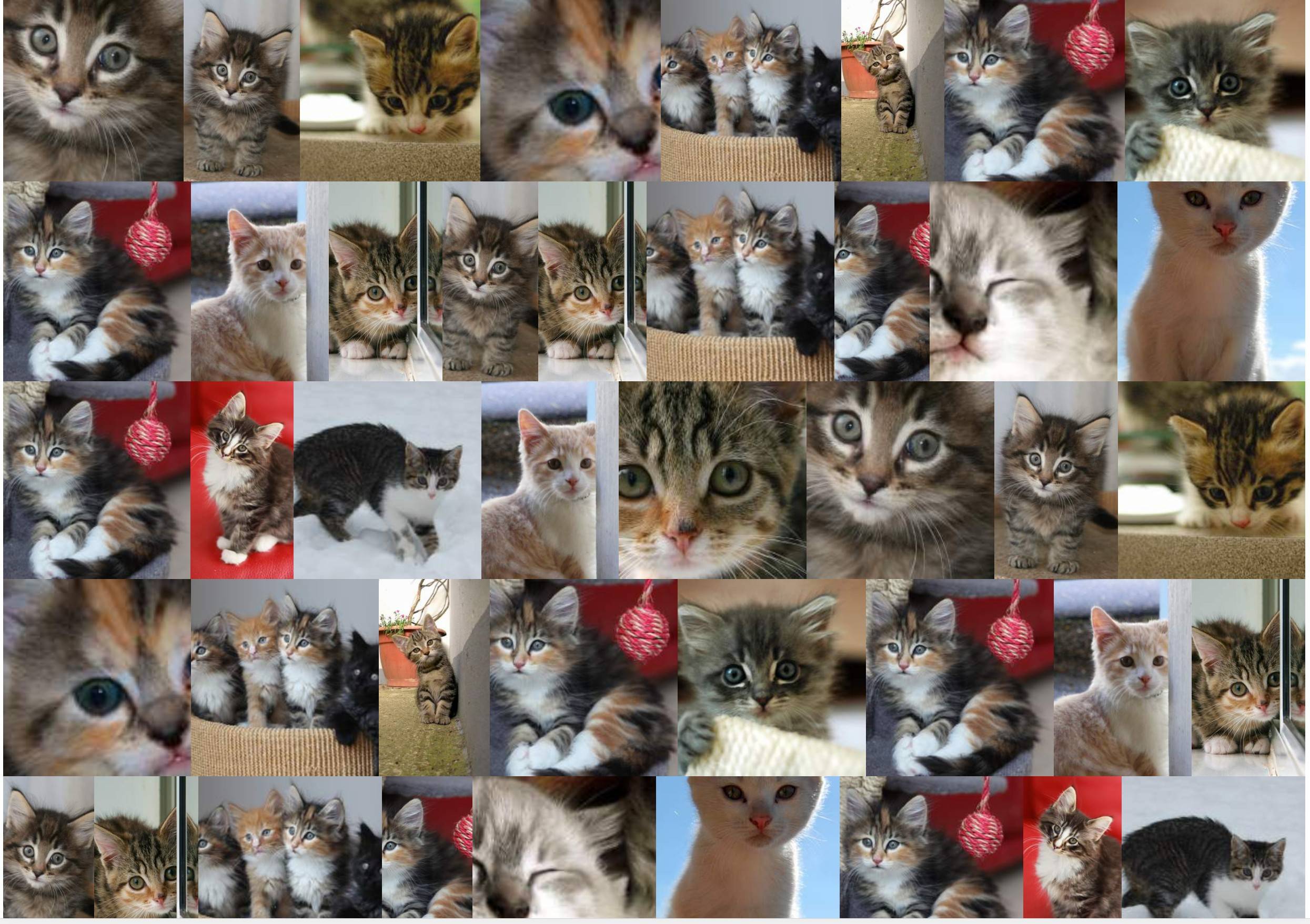
Tôi đã tìm kiếm các giải pháp để tăng số lượng phần tử trên mỗi dòng trên toàn cầu để hình ảnh không bị phóng to (hoặc ít nhất là không quá nhiều: ví dụ: tối đa 10%).
Hai giải pháp hackish tôi đã tìm thấy cho đến nay là:
Giải pháp 1
Sử dụng thuộc tính thu phóng :
section {
  display: flex;
  flex-flow: row wrap;
  justify-content: center;
  zoom: 50%;
}
section a {
  flex: auto;
}
section img {
  height: 100%;
  width: 100%;
  object-fit: cover;
}
<!DOCTYPE html>
<html lang="en">
<head>
    <title>Controlling flex growability</title>
    <meta name="viewport" content="width=device-width,initial-scale=1">
    <style>

    </style>
</head>
<body>
    <section>
        <a href="#"><img src="https://placekitten.com/400/195" width="400" height="195" alt="Kitty"></a>
        <a href="#"><img src="https://placekitten.com/256/400" width="256" height="400" alt="Kitty"></a>
        <a href="#"><img src="https://placekitten.com/400/237" width="400" height="237" alt="Kitty"></a>
        <a href="#"><img src="https://placekitten.com/400/111" width="400" height="111" alt="Kitty"></a>
        <a href="#"><img src="https://placekitten.com/400/245" width="400" height="245" alt="Kitty"></a>
        <a href="#"><img src="https://placekitten.com/400/227" width="400" height="227" alt="Kitty"></a>
        <a href="#"><img src="https://placekitten.com/250/400" width="250" height="400" alt="Kitty"></a>
        <a href="#"><img src="https://placekitten.com/400/269" width="400" height="269" alt="Kitty"></a>
        <a href="#"><img src="https://placekitten.com/400/255" width="400" height="255" alt="Kitty"></a>
        <a href="#"><img src="https://placekitten.com/288/400" width="288" height="400" alt="Kitty"></a>
        <a href="#"><img src="https://placekitten.com/234/400" width="234" height="400" alt="Kitty"></a>
        <a href="#"><img src="https://placekitten.com/194/400" width="194" height="400" alt="Kitty"></a>
        <a href="#"><img src="https://placekitten.com/222/400" width="222" height="400" alt="Kitty"></a>
        <a href="#"><img src="https://placekitten.com/400/227" width="400" height="227" alt="Kitty"></a>
        <a href="#"><img src="https://placekitten.com/192/400" width="192" height="400" alt="Kitty"></a>
        <a href="#"><img src="https://placekitten.com/400/141" width="400" height="141" alt="Kitty"></a>
        <a href="#"><img src="https://placekitten.com/400/289" width="400" height="289" alt="Kitty"></a>
        <a href="#"><img src="https://placekitten.com/400/255" width="400" height="255" alt="Kitty"></a>
        <a href="#"><img src="https://placekitten.com/210/400" width="210" height="400" alt="Kitty"></a>
        <a href="#"><img src="https://placekitten.com/400/187" width="400" height="187" alt="Kitty"></a>
    </section>
</body>
</html>
Nhưng tài sản đó hoạt động rất tốt trong Chrome, không phải trong Firefox.
Giải pháp 2
Mô phỏng thuộc tính thu phóng với chiều rộng / chiều cao và biến đổi: scale : scale :
section {
  display: flex;
  flex-flow: row wrap;
  justify-content: center;
  width: 200% !important;
  height: 200% !important;
  transform-origin: 0 0;
  transform: scale(0.5);
  float: left;
  margin-right: -100000px;
  margin-bottom: -100000px;
}
section a {
  flex: auto;
}
section img {
  height: 100%;
  width: 100%;
  object-fit: cover;
}
<!DOCTYPE html>
<html lang="en">
<head>
    <title>Controlling flex growability</title>
    <meta name="viewport" content="width=device-width,initial-scale=1">
    <style>

    </style>
</head>
<body>
    <section>
        <a href="#"><img src="https://placekitten.com/400/195" width="400" height="195" alt="Kitty"></a>
        <a href="#"><img src="https://placekitten.com/256/400" width="256" height="400" alt="Kitty"></a>
        <a href="#"><img src="https://placekitten.com/400/237" width="400" height="237" alt="Kitty"></a>
        <a href="#"><img src="https://placekitten.com/400/111" width="400" height="111" alt="Kitty"></a>
        <a href="#"><img src="https://placekitten.com/400/245" width="400" height="245" alt="Kitty"></a>
        <a href="#"><img src="https://placekitten.com/400/227" width="400" height="227" alt="Kitty"></a>
        <a href="#"><img src="https://placekitten.com/250/400" width="250" height="400" alt="Kitty"></a>
        <a href="#"><img src="https://placekitten.com/400/269" width="400" height="269" alt="Kitty"></a>
        <a href="#"><img src="https://placekitten.com/400/255" width="400" height="255" alt="Kitty"></a>
        <a href="#"><img src="https://placekitten.com/288/400" width="288" height="400" alt="Kitty"></a>
        <a href="#"><img src="https://placekitten.com/234/400" width="234" height="400" alt="Kitty"></a>
        <a href="#"><img src="https://placekitten.com/194/400" width="194" height="400" alt="Kitty"></a>
        <a href="#"><img src="https://placekitten.com/222/400" width="222" height="400" alt="Kitty"></a>
        <a href="#"><img src="https://placekitten.com/400/227" width="400" height="227" alt="Kitty"></a>
        <a href="#"><img src="https://placekitten.com/192/400" width="192" height="400" alt="Kitty"></a>
        <a href="#"><img src="https://placekitten.com/400/141" width="400" height="141" alt="Kitty"></a>
        <a href="#"><img src="https://placekitten.com/400/289" width="400" height="289" alt="Kitty"></a>
        <a href="#"><img src="https://placekitten.com/400/255" width="400" height="255" alt="Kitty"></a>
        <a href="#"><img src="https://placekitten.com/210/400" width="210" height="400" alt="Kitty"></a>
        <a href="#"><img src="https://placekitten.com/400/187" width="400" height="187" alt="Kitty"></a>
    </section>
</body>
</html>
Giải pháp đó đã hoạt động cho đến nay, nhưng yêu cầu một vài hack, và không còn thanh lịch và bây giờ sẽ có tác động với các yếu tố khác của trang.
Có giải pháp nào khác, định hướng flexgrid hơn cho phép loại điều khiển đó không? Tôi đã thử sử dụng flex-grow: 0 : nó, thực sự, vô hiệu hóa các mục đang phát triển, nhưng sau đó có những khoảng trống xung quanh hình ảnh ở khắp mọi nơi.
zoomvì nó sửa tất cả các hàng có cùng chiều cao, bằng cách đó: nó ngăn thuật toán flex tự nhiên "thích ứng" với thứ gì đó "tối ưu nhất có thể". Theo như tôi hiểu, vẫn chưa thể đạt được những gì tôi muốn theo cách tương thích và không hack.