Tôi muốn tạo một thanh tiến trình như trong hình dưới đây:

Tôi không có ý tưởng về việc tạo ra cái này. Tôi có nên sử dụng các kỹ thuật HTML5 không?
Bạn vui lòng cho tôi một số trợ giúp về cách tạo thanh tiến trình này?
Câu trả lời:
#progressbar {
  background-color: black;
  border-radius: 13px;
  /* (height of inner div) / 2 + padding */
  padding: 3px;
}

#progressbar>div {
  background-color: orange;
  width: 40%;
  /* Adjust with JavaScript */
  height: 20px;
  border-radius: 10px;
}<div id="progressbar">
<div></div>
</div>(CHỈNH SỬA: Đánh dấu cú pháp đã thay đổi; đã thay đổi con cháu thành bộ chọn con)
http://jsfiddle.net/cwZSW/1406/
#progress {
    background: #333;
    border-radius: 13px;
    height: 20px;
    width: 300px;
    padding: 3px;
}

#progress:after {
    content: '';
    display: block;
    background: orange;
    width: 50%;
    height: 100%;
    border-radius: 9px;
}<div id="progress"></div>border-radius, -webkit-border-radiushoặc-moz-border-radius
Câu trả lời năm 2014 : Kể từ năm 2014 HTML hiện nay 5 bao gồm một mã<progress> element không cần JavaScript. Giá trị phần trăm di chuyển theo tiến trình sử dụng nội dung nội tuyến. Chỉ được thử nghiệm trong webkit. Hy vọng nó giúp:
CSS:
progress {
	display:inline-block;
	width:190px;
	height:20px;
	padding:15px 0 0 0;
	margin:0;
	background:none;
	border: 0;
	border-radius: 15px;
	text-align: left;
	position:relative;
	font-family: Arial, Helvetica, sans-serif;
	font-size: 0.8em;
}
progress::-webkit-progress-bar {
	height:11px;
	width:150px;
	margin:0 auto;
	background-color: #CCC;
	border-radius: 15px;
	box-shadow:0px 0px 6px #777 inset;
}
progress::-webkit-progress-value {
	display:inline-block;
	float:left;
	height:11px;
	margin:0px -10px 0 0;
	background: #F70;
	border-radius: 15px;
	box-shadow:0px 0px 6px #777 inset;
}
progress:after {
	margin:-26px 0 0 -7px;
	padding:0;
	display:inline-block;
	float:left;
	content: attr(value) '%';
}<progress id="progressBar" max="100" value="77"></progress>Tôi thích cái này:
rất mượt mà chỉ có phần này là HTML và phần CSS3 còn lại tương thích ngược (mặc dù nó sẽ ít phức tạp hơn)
Chỉnh sửa Mã đã thêm bên dưới, nhưng được lấy trực tiếp từ trang trên, tất cả đều ghi công cho tác giả đó
.meter {
  height: 20px;
  /* Can be anything */
  position: relative;
  background: #555;
  -moz-border-radius: 25px;
  -webkit-border-radius: 25px;
  border-radius: 25px;
  padding: 10px;
  -webkit-box-shadow: inset 0 -1px 1px rgba(255, 255, 255, 0.3);
  -moz-box-shadow: inset 0 -1px 1px rgba(255, 255, 255, 0.3);
  box-shadow: inset 0 -1px 1px rgba(255, 255, 255, 0.3);
}

.meter>span {
  display: block;
  height: 100%;
  -webkit-border-top-right-radius: 8px;
  -webkit-border-bottom-right-radius: 8px;
  -moz-border-radius-topright: 8px;
  -moz-border-radius-bottomright: 8px;
  border-top-right-radius: 8px;
  border-bottom-right-radius: 8px;
  -webkit-border-top-left-radius: 20px;
  -webkit-border-bottom-left-radius: 20px;
  -moz-border-radius-topleft: 20px;
  -moz-border-radius-bottomleft: 20px;
  border-top-left-radius: 20px;
  border-bottom-left-radius: 20px;
  background-color: #f1a165;
  background-image: -webkit-gradient(linear, left top, left bottom, color-stop(0, #f1a165), color-stop(1, #f36d0a));
  background-image: -webkit-linear-gradient(top, #f1a165, #f36d0a);
  background-image: -moz-linear-gradient(top, #f1a165, #f36d0a);
  background-image: -ms-linear-gradient(top, #f1a165, #f36d0a);
  background-image: -o-linear-gradient(top, #f1a165, #f36d0a);
  -webkit-box-shadow: inset 0 2px 9px rgba(255, 255, 255, 0.3), inset 0 -2px 6px rgba(0, 0, 0, 0.4);
  -moz-box-shadow: inset 0 2px 9px rgba(255, 255, 255, 0.3), inset 0 -2px 6px rgba(0, 0, 0, 0.4);
  position: relative;
  overflow: hidden;
}<div class="meter">
<span style="width: 33%"></span>
<!-- I use my viewmodel in MVC to calculate the progress and then use @Model.progress to place it in my HTML with Razor -->
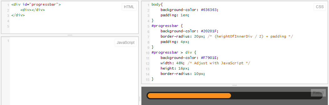
</div>Giống như câu trả lời của @ RoToRa, với một số điều chỉnh nhỏ (màu sắc và kích thước chính xác):
body {
  background-color: #636363;
  padding: 1em;
}

#progressbar {
  background-color: #20201F;
  border-radius: 20px; /* (heightOfInnerDiv / 2) + padding */
  padding: 4px;
}

#progressbar>div {
  background-color: #F7901E;
  width: 48%;
  /* Adjust with JavaScript */
  height: 16px;
  border-radius: 10px;
}<div id="progressbar">
<div></div>
</div>Đây là trò chơi: jsFiddle
Và đây là những gì nó trông như thế này:
Trong các trình duyệt hiện đại, bạn có thể sử dụng Phần tử tiến trình CSS3 & HTML5!
progress {
  width: 40%;
  display: block; /* default: inline-block */
  margin: 2em auto;
  padding: 3px;
  border: 0 none;
  background: #444;
  border-radius: 14px;
}
progress::-moz-progress-bar {
  border-radius: 12px;
  background: orange;

}
/* webkit */
@media screen and (-webkit-min-device-pixel-ratio:0) {
  progress {
    height: 25px;
  }
}
progress::-webkit-progress-bar {
    background: transparent;
}
progress::-webkit-progress-value {
  border-radius: 12px;
  background: orange;
} <progress max="100" value="40"></progress>Thanh tiến trình không có div lồng nhau ... cho mọi phần tử mà gradient tuyến tính css hoạt động.
Đây là JSFiddle http://jsfiddle.net/oj1L3y6t/2/
function show_progress(i) {
  var progress1 = i;
  var progress2 = progress1 + 1;
  var progress3 = progress1 + 2;

  var magic = "linear-gradient(to right, #FFC2CE " + progress1 + "% ,red " + progress2 + "% , #FFFFFF " + progress3 + "%)";
  document.getElementById("progress-0").style.background = magic;

  var magic = "linear-gradient(to right, lightblue " + progress1 + "% , lightgreen " + progress2 + "%)";
  document.getElementById("progress-1").style.background = magic;

  var magic = "linear-gradient(to right, lightblue " + progress1 + "% , #FFFFFF 100%)";
  document.getElementById("progress-2").style.background = magic;

  var magic = "linear-gradient(#FFC2CE " + progress1 + "% ,red " + progress2 + "% , #FFFFFF " + progress3 + "%)";
  document.getElementById("progress-3").style.background = magic;
}

function timeout() {
  t = setTimeout(function() {
    show_progress(t)
    timeout();
  }, 50);
  if (t == 78) {
    clearTimeout(t);
  }
  console.log(t);
}

timeout();
#progress-0 {
border: 1px solid black;
width: 500px;
background: #999;
text-align: center;
}
#progress-1 {
border: 1px solid black;
width: 500px;
background: #999;
text-align: center;
margin-top: 10px;
border-radius: 10px;
}
#progress-2 {
border: 1px solid black;
width: 500px;
background: #999;
text-align: center;
margin-top: 10px;
}
#progress-3 {
border: 1px solid black;
width: 100px;
height: 100px;
background: #999;
line-height: 100px;
text-align: center;
margin-top: 10px;
border-radius: 200px;
}<div id="progress-0">Loading</div>
<input id="progress-1" value="Loading"></input>
<button id="progress-2">Loading</button>
<p id="progress-3">Loading</p>Tạo một phần tử hiển thị phần bên trái của thanh (phần tròn), cũng tạo một phần tử cho phần bên phải. Đối với thanh tiến trình thực tế, hãy tạo phần tử thứ ba có nền lặp lại và chiều rộng tùy thuộc vào tiến trình thực tế. Đặt tất cả lên trên hình nền (có chứa thanh tiến trình trống).
Nhưng tôi cho rằng bạn đã biết rằng ...
Chỉnh sửa : Khi tạo thanh tiến trình không sử dụng nền văn bản. Bạn có thể sử dụng border-radiusđể có được hiệu ứng vòng, như được thể hiện bởi Rikudo Sennin và RoToRa !
.loading {
  position: relative;
  width: 50%;
  height: 200px;
  border: 1px solid rgba(160, 160, 164, 0.2);
  background-color: rgba(160, 160, 164, 0.2);
  border-radius: 3px;
}

span.loader {
  position: absolute;
  top: 40%;
  left: 10%;
  width: 250px;
  height: 20px;
  border-radius: 8px;
  border: 2px solid rgba(160, 160, 164, 0.8);
  padding: 0;
}

span.loader span.innerLoad {
  text-align: center;
  width: 140px;
  font-size: 15px;
  font-stretch: extra-expanded;
  color: #2A00FF;
  padding: 1px 18px 3px 80px;
  border-radius: 8px;
  background: rgb(250, 198, 149);
  background: -moz-linear-gradient(left, rgba(250, 198, 149, 1) 0%, rgba(245, 171, 102, 1) 47%, rgba(239, 141, 49, 1) 100%);
  background: -webkit-gradient(linear, left top, right top, color-stop(0%, rgba(250, 198, 149, 1)), color-stop(47%, rgba(245, 171, 102, 1)), color-stop(100%, rgba(239, 141, 49, 1)));
  background: -webkit-linear-gradient(left, rgba(250, 198, 149, 1) 0%, rgba(245, 171, 102, 1) 47%, rgba(239, 141, 49, 1) 100%);
  background: -o-linear-gradient(left, rgba(250, 198, 149, 1) 0%, rgba(245, 171, 102, 1) 47%, rgba(239, 141, 49, 1) 100%);
  background: -ms-linear-gradient(left, rgba(250, 198, 149, 1) 0%, rgba(245, 171, 102, 1) 47%, rgba(239, 141, 49, 1) 100%);
  background: linear-gradient(to right, rgba(250, 198, 149, 1) 0%, rgba(245, 171, 102, 1) 47%, rgba(239, 141, 49, 1) 100%);
  filter: progid:DXImageTransform.Microsoft.gradient( startColorstr='#fac695', endColorstr='#ef8d31', GradientType=1);
}<div class="loading">
<span class="loader">
<span class="innerLoad">Loading...</span>
</span>
</div> .black-strip
{ width:100%;
height: 30px;
background-color:black;
}
.green-strip
{ width:0%;
height: 30px;
background-color:lime;
animation-name: progress-bar;
animation-duration: 4s;
animation-iteration-count: infinite;
}
@keyframes progress-bar {
from{width:0%}
to{width:100%}
}
<div class="black-strip">
<div class="green-strip">
</div>
</div>
Nếu bạn muốn có một thanh tiến trình mà không cần thêm một số mã, PACE có thể là một công cụ tuyệt vời cho bạn.
Chỉ cần bao gồm speed.js và một chủ đề CSS mà bạn chọn và bạn sẽ nhận được một chỉ báo tiến độ tuyệt đẹp cho tải trang và điều hướng AJAX của mình. Điều tốt nhất với PACE là tự động phát hiện tiến trình.
Nó cũng chứa nhiều chủ đề và bảng màu.
Đáng để thử.
.bar {
background - color: blue;
height: 40 px;
width: 40 px;
border - style: solid;
border - right - width: 1300 px;
border - radius: 40 px;
animation - name: Load;
animation - duration: 11 s;
position: relative;
animation - iteration - count: 1;
animation - fill - mode: forwards;
}

@keyframes Load {
100 % {
    width: 1300 px;border - right - width: 5;
}
background - color: blue;cần phảibackground-color: blue;
Đang sử dụng setInterval.
var totalelem = document.getElementById("total");
var progresselem = document.getElementById("progress");
var interval = setInterval(function(){
    if(progresselem.clientWidth>=totalelem.clientWidth)
    {
        clearInterval(interval);
        return;
    }
    progresselem.style.width = progresselem.offsetWidth+1+"px";
},10)
.outer
{
width: 200px;
height: 15px;
background: red;
}
.inner
{
width: 0px;
height: 15px;
background: green;
}<div id="total" class="outer">
<div id="progress" class="inner"></div>
</div>Đang sử dụng CSS Transtitions.
function loading()
{
    document.getElementById("progress").style.width="200px";
}
.outer
{
width: 200px;
height: 15px;
background: red;
}
.inner
{
width: 0px;
height: 15px;
background: green;
-webkit-transition:width 3s linear;
transition: width 3s linear;
}<div id="total" class="outer">
<div id="progress" class="inner"></div>
</div>
<button id="load" onclick="loading()">Load</button>Có một hướng dẫn để tạo thanh tiến trình HTML5 tại đây . Nếu bạn không muốn sử dụng các phương pháp HTML5 hoặc bạn đang tìm kiếm một giải pháp cho tất cả các trình duyệt, hãy thử mã này:
<div style="width: 150px; height: 25px; background-color: #dbdbdb;">
<div style="height: 25px; width:87%; background-color: gold"> </div>
</div>Bạn có thể thay đổi màu GOLD thành bất kỳ màu nào của thanh tiến trình và #dbdbdb thành màu nền của thanh tiến trình của bạn.
Tại sao bạn không thể tạo Nhiều ảnh cho mỗi phần của thanh trạng thái? Nếu đó là một phần ba chỉ hiển thị một phần ba thanh trạng thái ... nó rất đơn giản. Bạn có thể tìm ra cách thay đổi nó thành hình ảnh tiếp theo dựa trên đầu vào với thẻ biểu mẫu. Đây là phần mã của tôi, bạn phải tìm ra nội dung biểu mẫu sau
<form> <!--(extra code)-->
<!--first progress bar:-->
<img src="directory"></img>
<!--second progress bar:-->
<img src="directory"></img>
<!--et caetera...-->
</form>
Bây giờ nó có vẻ đơn giản, phải không?